The marketing mix I will be analysing will be the one produced for Final Destination 5, which is a 2011 horror film written by Eric Heisserer and directed by Steven Quale. It is the fifth installment of the Final Destination films. The film follows a group of young adults who go on a work related trip to the Maldives. On the journey there, one of them has a premonition that the bridge they are traveling over will break and they will all die. As a result of this premonition, he gets as many people off the bridge as he can, and therefore death 'chases after them' as they weren't meant to survive on the bridge.
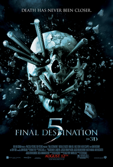
The adverts and posters used for this film have a very specific colour scheme to reflect the mood and genre of the film. They all tend to have dull and dark colours using grays and blacks. The only colour in some of the posters is red, which has connotations towards blood which fits with the genre of the film. The adverts used to promote the film on television use hectic music and lots of cuts from scene to scene which creates a sense of panic and unease and lets the viewer know what to expect from the film.

The film was successful and ranked number 3 at that weekends box office behind with $18.4 million behind The Rise Of The Planet Of The Apes and The Help. It was also the 3rd biggest Final Destination opening date behind 2009's The Final Destination and 2006's Final Destination 3. So far, Final Destination 5 has grossed $41.8 million domestically, $76.3 overseas and bringing in a total of $118.1 million world wide.

The website that is used to promote this film uses the above image as the main home page. As the cursor moves around the page, the image moves with it, giving the viewer some interaction with the website. The only colours used on the websites are greys blacks and red, this shows continuity with the posters/advertising and the website. The fact that the website is interactive will make the people that go on it feel involved as it moves as their cursor moves, and it also mirrors the fact that the film is in 3d, and makes the audience feels included. The trailer for the film also uses these dull colours. There are parts of the trailer that show some of how the cast die, these parts are cloudy which leaves some to the imagination and makes the audience want to watch the film in order to find out what happens. There is also a lot of flashing on the screen which shows how hectic and stressful the film is going to be.
The film is in 3d which adds to the appeal of the film as the experience will be more real and more people may be drawn in by this. As the film is the fifth in the series, people will know what to expect from them and to see this type of film in 3d will be more appealing to some of the fans than in 2d. The 3d tickets are more expensive than the 2d ones, but are included in such deals as 'Orange Wednesdays'. Offers such as these also make the film more popular as the prospect of saving money and seeing a film they enjoy is a nice one indeed.
To ensure maximum publicity, the film also had advertisements in magazines, as well as posters, adverts and trailers. Some of the magazines that the advert was featured in include: Empire Magazine, Creole Magazine, New York Magazine and Rave Magazine. As these magazines are read by many people, this will make a lot of people aware that this film is being shown, and will therefore get more people wanting to see it.
The film also has adverts on popular social network sites like twitter. This may make the user of the website look into it further or make an update about the film on their profile. Because twitter and facebook are such popular websites and are used daily by thousands of people, the advert will most definitely be seen.

No comments:
Post a Comment